Legalshield associates-only back office
LegalShield, a company that sells legal service products through independent associates, had a complex back office designed to support its workforce. Associates used it to track sales, access training materials, manage their teams, and more. However, the experience was difficult to navigate, and users often struggled to find what they needed because information was scattered across multiple sites.
LegalShield requested a redesigned, user-friendly platform to help associates accomplish their goals more efficiently.
Role
UX Research & Design
Duration
3 Months
When
October 2017
What
Dashboard design
Goal
Create a cohesive, easily navigated back office experience for associates.
Market
LegalShield Associates of all levels looking to keep track of sales, promotions, and access training material.
Problem
Online resources are split across multiple sites, often causing associates to miss important information for their business.
Mission
Combine the different sites into a single, manageable experience and update the look and feel to match LegalShield.com
User Interviews
To understand user needs, we interviewed a range of associates, from top sellers to newcomers, to capture a broad perspective.
We asked them to walk us through their daily tasks, show how they accessed key materials, and share pain points, positive experiences, and desired features. While their input was valuable, the biggest insights came from observing how they navigated the system and the indirect paths they took to find information.
The interviews confirmed that users wanted quick access to sales data and a clearer hierarchy of information. Most importantly, they reinforced our main assumption: the scattered sites caused users to miss important content, and they strongly preferred a single, unified experience.

Competitive User Flows
Next, I compared the path of a LegalShield associate to associates from competing companies. This process allowed us to see differences in journey length, opportunities for content simplification, and alternative options for how to present materials and statistics to associates.

Site Architecture
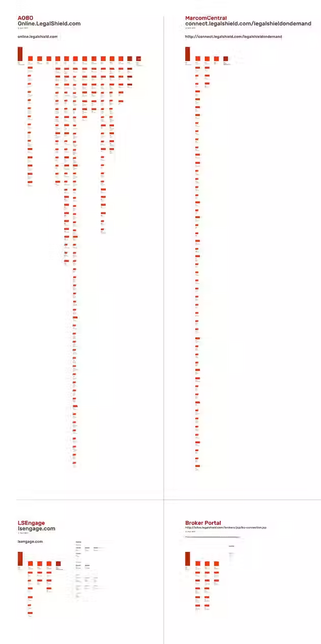
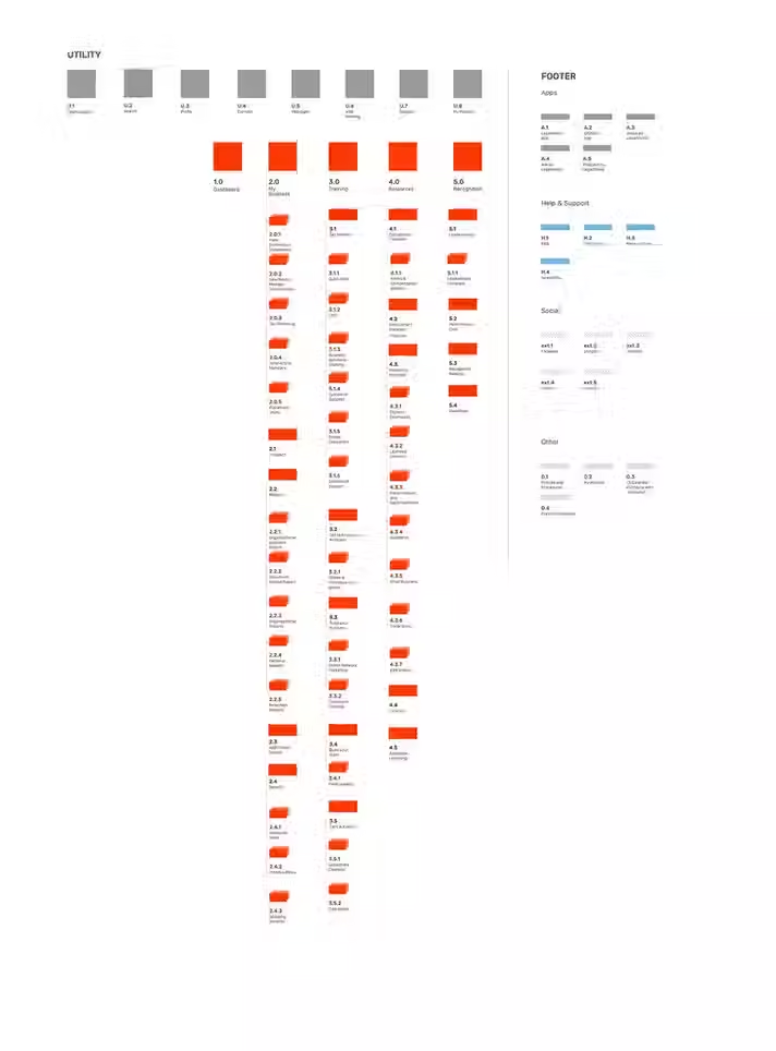
After gaining clarity on the information users needed, I audited the roughly 18 different back office sites. I identified duplicate content, outdated materials, and opportunities to combine pages. Based on this, I created a proposed sitemap for the new back office.
The new sitemap consolidated content into high-level landing pages with more intuitive paths to key information.
These are examples of the original, more complex sitemaps alongside my proposed, streamlined version. I also recommended adding a footer for lower-priority items that still benefit from being easily accessible.

Wireframes
With the sitemap finalized and priorities defined, I moved on to wireframes. I collaborated closely with the tech team to understand feasibility and with the design team to ensure alignment with LegalShield’s UI. I started with key screens like the landing page and associate analytics, then expanded to cover all user flows and processes associates would encounter.
Handoff to Design and Tech
After the user flows were completed, I provided annotated screens to the development team so the designs could be built out with proper interactions. I was available to the tech team if changes needed to be made based on tech feasibility, and ensured any changes maintained the new and improved experience.
Once tech signed off, and the flows were approved by the LegalShield stakeholders, visual design took the wireframes and updated them to LegalShields UI.

Final Design
As the design team worked, I made sure designs did not compromise the experience, or create new feasibility issues and was available if content needed to shift or change in order to maintain consistency. Here is a selection of the screens from the final design.


