Drawing America site architecture
Drawing America was a group created with the intention of helping artists develop their skills and form a community to grow within. With the circumstances of the global pandemic, the community has moved entirely online. Online classes and communication come with challenges unique to artists, while creating new opportunity to expand the user base. The current site lacks organization and proper labeling. The quantity and overlap between navigations has become overwhelming, and the homepage doesn’t clearly explain Drawing America and its offerings for potential members.
My goal was to present a plan to understand and improve the site architecture, while increasing the user base and site engagement
Role
UX Architecture & Design
Duration
1 Month
When
June 2020
What
Navigation redesign
Navigation Approach
Consolidated
-
Remove any duplication
-
Flexible overall structure
-
True global navigation design and structure
-
Consistent way-finding approaches
User Centric
-
Different content based on registration status
-
Reduce cognitive effort and repetition
-
Standard visual cues and emphasis
-
Move toward simplified, user-friendly language

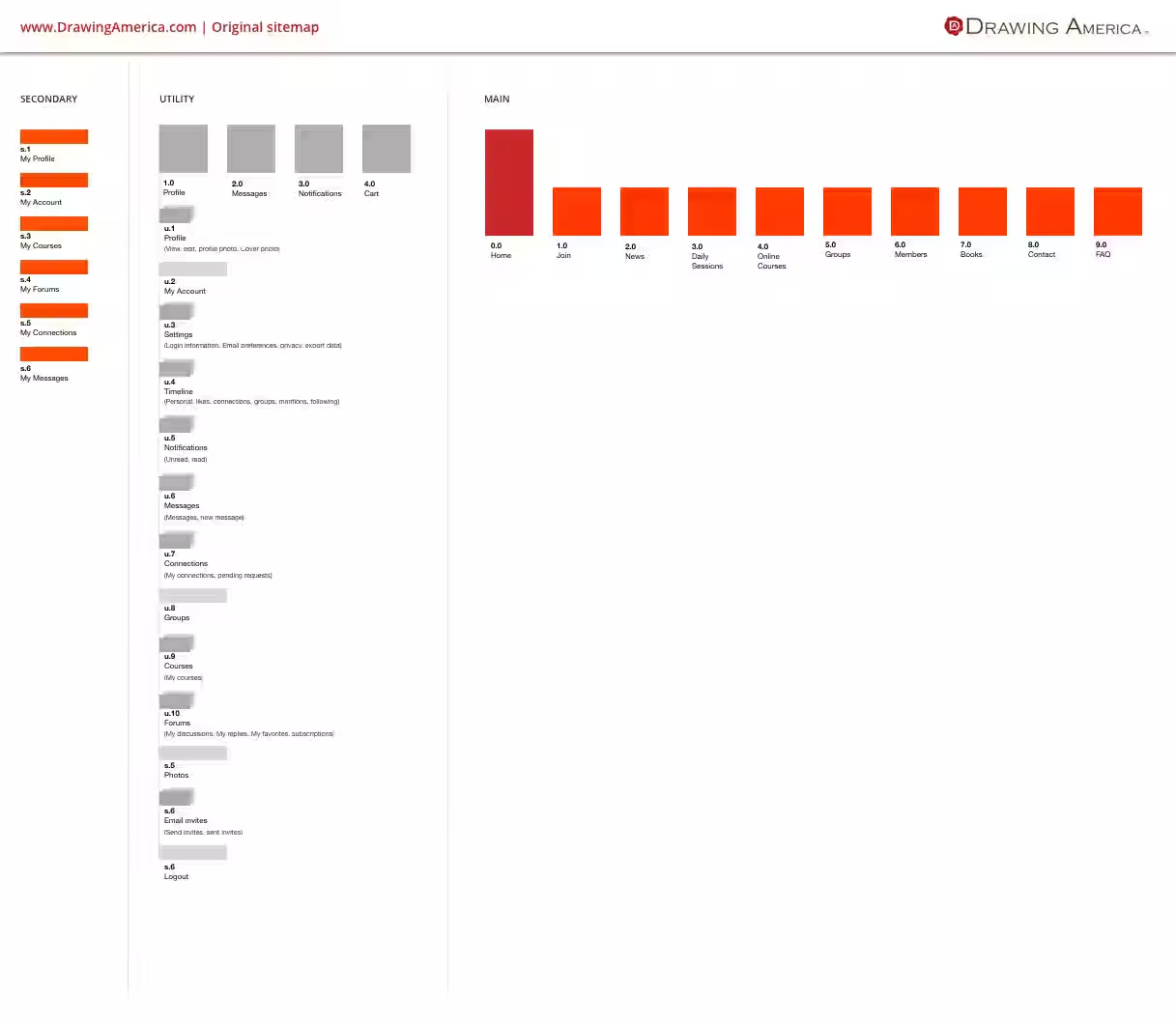
Original Site Navigation
Originally, the navigation was split between a horizontal navigation and an additional vertical navigation on the left side. Ideally, there would a single navigation for users, making it easier to know where to find the content they were looking for.

Proposed Site Navigation
Through open card sorting exercises I was able to come up with a simplified, proposed navigation that removes duplication and simplifies the users paths. Reducing the horizontal navigation from 9 to 5 items, removing the vertical navigation and adding a footer creates a less cluttered navigation and more opportunity to engage the user.
In addition to removing duplication and reorganization, renaming items to better match their content (for example news becoming articles and events) will simplify the user experience.
Original Site Navigation Vs. Proposed Design


Additional Wireframes
I created a couple concept pages to further improve the user experience of the site, and illustrate how certain duplicative elements are combined. I focused on the homepage and the course page
Currently, the homepage is the same for all users, whether or not they are members or logged in. It should clearly explain what Drawing America offers, introduce the site’s content, and include clear calls to action to join and explore.
At the moment, the course page also remains unchanged even after a user registers for courses. Instead of maintaining a separate "My Courses" page, I propose updating the main course page to reflect a user's registrations by including a dedicated section for their courses. This would allow registered courses to be removed from the general course list, making other available courses easier to discover.
Next Steps
With the navigation currently being implemented, the next step will be conduct usability tests and interviews with current users to see how their paths have improved