%202.png)
Finished Product
After development, a few final adjustments were needed before the event, including adding a magnifying feature to improve visibility of locations on the globe. Once internal testing was complete, the product was ready for real-world use.
At ARVO, our team was on-site to ensure proper setup and observe how users interacted with the globe, gathering insights to improve the experience moving forward.
Boehringer Ingelheim: Retinal Health
Boehringer Ingelheim needed a unique knowledge sharing tool for the Association for Research in Vision and Ophthalmology (ARVO) Conference in 2024 to present retinal health research from around the world. In combination with a more traditional touch screen, also designed by HCG, we proposed a using a sphere in which users could interact with an actual globe and select research studies of interest from specific locations.
Role
Lead Research, UX
Duration
8 Weeks
When
May 2024
What
Research showcase panel at ARVO 2024
Goal
Design a product for a sphere that achieved our needs within the technical limitations of the device while engaging users in a meaningful way.
Market
Attendees of the annual Association for Research in Vision and Ophthalmology (ARVO) conference in 2024
Problem
Conferences have an overwhelming amount of content for attendees to see, we need a way to more deeply engage and interest users
Mission
Create a product for a sphere which would allow conference attendees to view information from research studies within the context of their location on the globe
Research & Discovery: Learning the capabilities of a new device
The first step was to understand the capabilities and functionality of existing products for sphere devices. Pulling from youtube videos and developer guidelines, we captured different pieces that could potentially be put together and used for our product. Because spheres were a new-to-us device, we needed to make a lot of assumptions on how the final product could work.

Pinpointing study locations locations
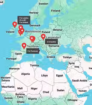
Knowing we wanted to design a globe, we needed to see how the study locations would live together on the world map. By adding pins to a map, we learned that many of the study locations overlapped.
Overlapping locations created a need to find solutions in which users could easily select different locations without accidentally tapping a different one, and also a way to see all of the studies clearly.
Capabilities: designing for the different needs of the product
Using the initial research I began to dive into possible solutions for our three main capabilities
Filtering
One requirement was the ability to filter studies by both indication and topic. We initially explored a two-layer approach: first filtering by indication, then topic, but development constraints required a shift.
We adapted the design to a single-layer filter that still clearly represented both criteria through visual cues.
QR Codes
The spherical display limited screen visibility, making some content hidden or hard to read. To address this, we used QR codes so users could access information on their own devices.
The codes needed to be large enough to scan easily and paired with clear instructions and context.
Knowledge Sharing
The main goal of the product was to relay information from retinal health studies to users -- but there was the challenge of a limited amount of real estate that could be used.
We needed a solution that presented clear, scannable information for users during device interaction.

Product Architecture
We began with a list of research studies categorized by indication and study topic. The initial sitemap reflected this with two layers of filtering, showing each indication with all relevant study topics listed beneath.
We initially assumed this dual-filtering approach was feasible, but after reviewing it with the development team, we learned it was beyond our budget and timeline. The sitemap, and eventually the product, was revised to use a single filter for study topic, with indications represented through a color-coding system and legend.
Wireframes
The research and architecture gave us the takeaways needed to begin developing the product visually in wireframes. We incorporated the following into initial designs:
-
A way for users to see all study location pinpoints clearly
-
Filtering and a clear representation of both indication and study topic
-
Easily scannable QR codes with clear instructions and prompts
-
Legible, easily scannable blocks of information for users to interact with


Final Design
The wireframes served as a foundation for the UI designers, who began shaping the look and feel of the product. Visual design progressed alongside initial development, which helped surface additional usability concerns.
I worked closely with the UI team throughout, continuously refining the product as it moved toward its final version.


